
Wbee Header Footer & Mega Menu Builder for Elementor
Build professional headers, footers, and mega menus visually with Elementor.
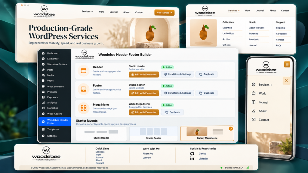
Design the bar, the footer, and the panels that open from your menu. WordPress still owns the menu. Elementor owns the layout. You decide where each template appears.
Requires Elementor (free). WordPress 6.0 or newer.
What can you build?
Site chrome, designed as Elementor templates.
Headers and footers are templates with display rules. Navigation is a WordPress menu. A mega menu is an Elementor panel attached to one top-level item.
Header builder
Shape the bar in Elementor. No theme code.
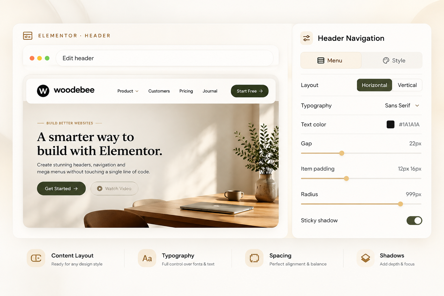
Create a header, then edit it with Elementor. Drop in Site Logo, Header Nav, and Header CTA. Colors, type, spacing, radius, and the sticky look are style controls.
1. Website header. Logo, links, button, and optional item icons sit in one bar.
2. Elementor canvas. The same bar, selected, with Woodebee HF widgets in the panel.
3. Published result. Sticky, transparent, shrink, blur, border, and shadow are header settings — per desktop, tablet, and mobile.
Footer builder
One footer document. Any Elementor layout.
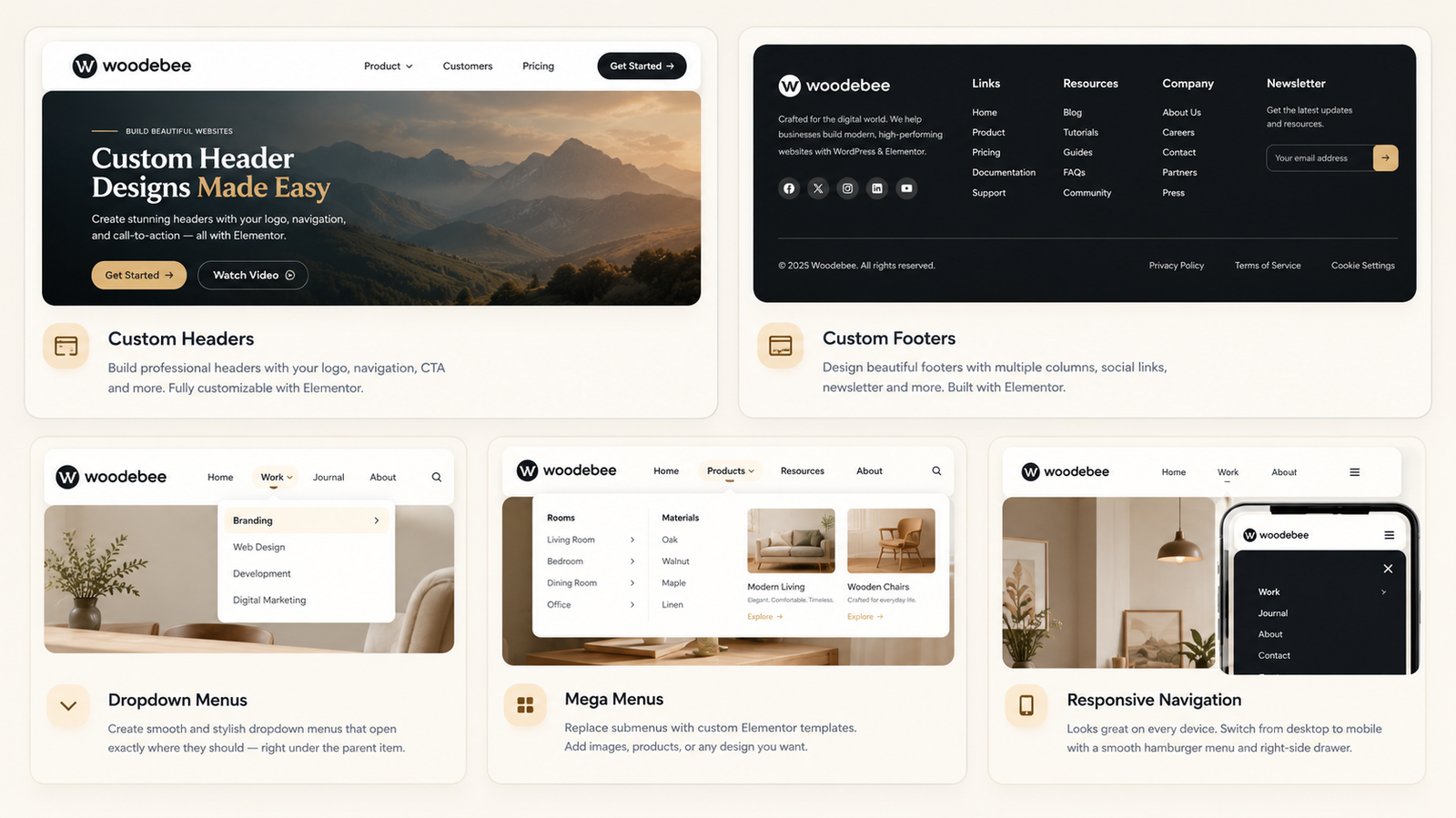
The included Studio footer is a brand column, three Icon Lists, and a Copyright line. The other layouts here are the same kind of template after you restyle it in Elementor.

Copyright accepts {year} and {site}. Columns, forms, and icons are Elementor widgets you place in the footer template. Display rules decide which footer shows: entire site, homepage, singular, archives, search, 404, and WooCommerce screens when WooCommerce is active.
Mega menu
The panel is Elementor. The shell is Wbee.
Wbee sizes and positions the outer panel: custom width, centered under the item, or full width of the navigation. Columns, images, icons, and links are widgets you place inside.

Elementor editing
Design your navigation visually instead of coding it.
Open any header, footer, or mega menu with Elementor. Widgets in the Woodebee HF category cover the bar. Everything inside a mega panel can be any Elementor widget.
Site Logo — custom image, Customizer logo, or site title.
Header Nav — menu, dropdowns, mega panels, hamburger.
Header CTA — gold, ink, ghost, or outline.
Copyright — {year} and {site}.
Responsive navigation
Same header. Three widths.
Header Nav collapses below the breakpoint you pick: laptop 1200, tablet 1024, or mobile 767. The drawer is a full-height side panel with a backdrop, close icon, and Escape to dismiss. Switch Elementor to tablet or mobile to preview it.

How it works
Four steps from blank to published.
Create your layout
Open Woodebee Header Footer. Start blank, or install Studio header, Studio footer, or the Gallery mega menu.
Design it with Elementor
Edit with Elementor. Place Site Logo, Header Nav, Header CTA, and Copyright. Build the mega panel with whatever widgets you need.
Choose where it appears
Headers and footers use Include and Exclude rules, an audience, and a priority. Mega menus are assigned on a top-level item under Appearance → Menus.
Publish
Activate the header or footer. A mega menu shows Active once a menu item uses it. The matching theme header or footer is hidden.
Feature summary
What the plugin actually does.
Templates stay on your site. No telemetry and no remote scripts.
Header templates
Create, duplicate, activate, and edit headers in Elementor. The Studio starter is logo, nav, and a gold CTA.
Footer templates
Same dashboard for footers. Studio footer is a brand column, three Icon Lists, and a legal bar.
Mega menu panels
Elementor documents attached to a top-level menu item. They do not use display conditions.
Dropdowns
With no panel assigned, child items render as a normal submenu. Style type, color, gap, and padding on Header Nav.
Display conditions
Include or exclude the entire site, homepage, singular, archives, search, and 404. WooCommerce adds shop, products, categories, cart, checkout, and My account.
Audience and priority
Show a template to everyone, logged-in visitors, or logged-out visitors. If several match, the most specific rule wins, then priority.
Sticky header
Pin on desktop, tablet, or mobile. Offset, shrink, blur, scrolled colors, border, shadow, and hide on scroll down.
Transparent header
Overlay the hero. Set the starting background, including transparent, on the header document.
Hamburger and drawer
Collapse below 1200, 1024, or 767px. Style the toggle, close icon, drawer width, padding, background, backdrop, and link colors.
Panel width
Custom width from 240 to 1920 pixels, centered under the item, or full width of the navigation wrap.
Icon and badge
Optional Font Awesome class and a badge on the menu item, beside the parent label.
Theme chrome
When a Wbee header or footer is active, matching theme markup is hidden with selectors you can edit in Settings.
Wbee Header Footer & Mega Menu Builder
Build better headers. Smarter navigation. With Elementor.
Lay out the bar, the footer, and the panels visually. Set where they appear. Publish without writing navigation CSS.